
I’m a graphic design and studio arts student who loves the challenge.
Resilience Conference
For this conceptual project, I created a full brand identity for a fictional rock music conference. The primary challenge was to design an experimental typography–based logo, so I developed a guitar-inspired mark that morphs the letterforms of the word Resilience, giving the logo both structure and expressive movement.
To push the visual identity in a fresh direction, I intentionally chose a vibrant palette of pinks, reds, and ivory—colors not typically associated with traditional rock aesthetics. This contrast helped create a bold, contemporary look that still carries the energy of the genre. The full branding system includes a guide map, event lanyards, banners, tickets, and a series of promotional posters, all designed to create a cohesive and immersive conference experience.
The Catcher in
the Rye
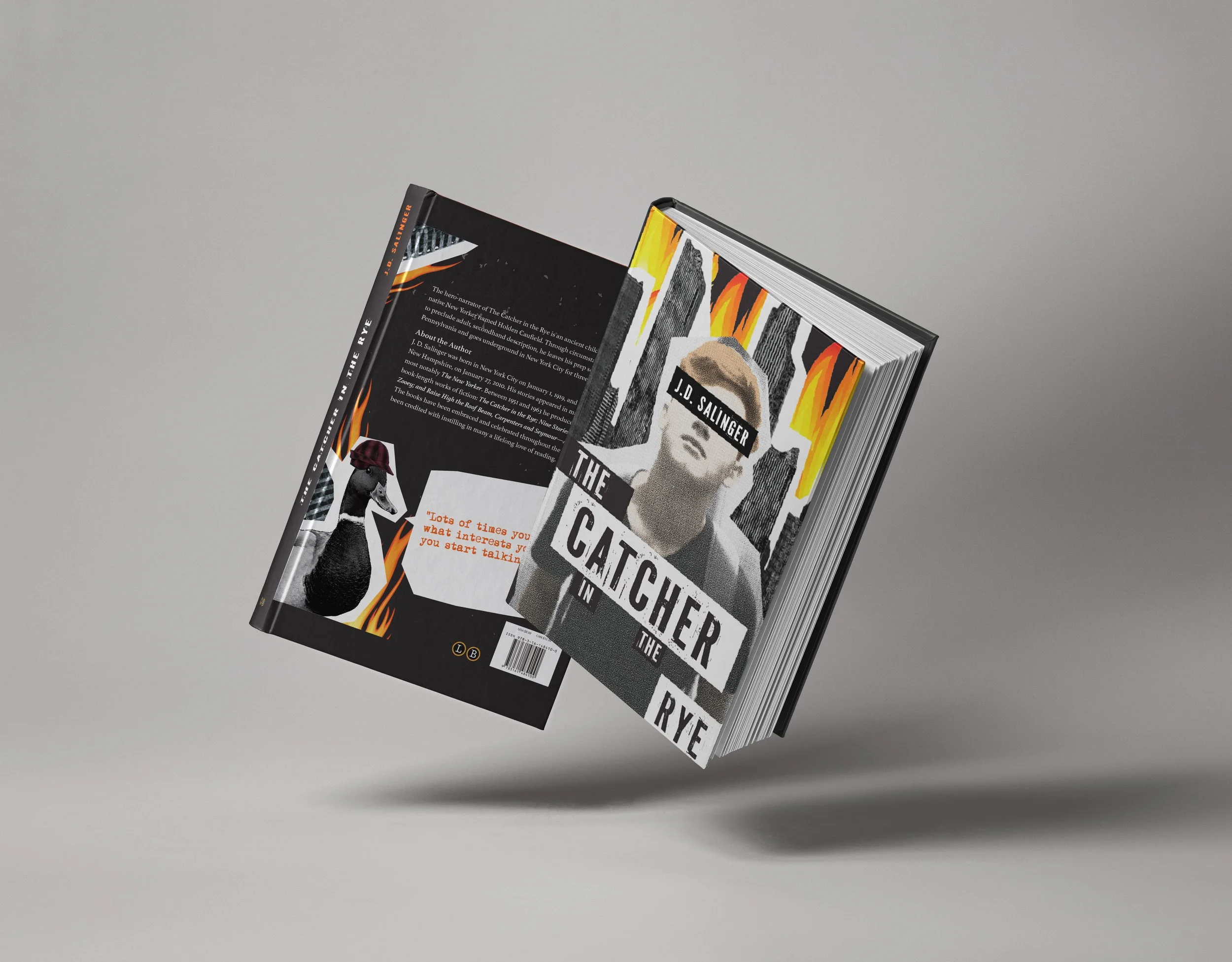
For this project, I was assigned to make a book cover of The Catcher in the Rye by J.D. Salinger. Instead of focusing only on a book cover, I expanded the concept into a small visual collection, including T-shirts, posters, bookmarks, and other promotional pieces. I leaned into the novel’s gritty, rebellious tone and explored grungy, edgy themes that reflect Holden Caulfield’s perspective.
Using key quotes and symbolic elements from the story, I incorporated visual references throughout each design to capture the book’s mood and deeper meaning. My goal was to translate its iconic voice into a contemporary graphic style that feels bold, expressive, and true to the narrative.